The Psychology Behind Color Choices in Home Decor
In interior design, color is a powerful, non-verbal language that profoundly shapes our mood, emotions, and overall well-being.
This field of study, known as color psychology, explores the emotions, moods, and reactions that different colors trigger in us.
Scientifically, color is often the first thing we register when assessing anything, helping us to instinctively react to feelings of joy, pleasure, threat, or danger.
By applying insights from color psychology, individuals can create spaces that positively impact their daily lives, influencing everything from productivity to relaxation.
While individual responses to color can be subjective and influenced by personal and cultural experiences, there are widely accepted psychological associations for most colors.
Understanding these associations is crucial for creating environments that support desired moods or activities.
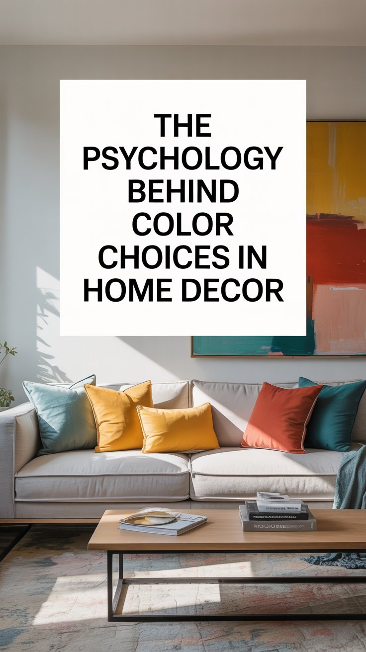
General Categories: Warm vs. Cool Colors
Colors are broadly categorized into warm and cool tones, each eliciting distinct psychological effects.
- Warm Colors such as red, orange, and yellow, tend to create a sense of energy, warmth, and excitement. They can stimulate conversation and encourage social interaction, making them suitable for living rooms and dining areas.
- Cool Colors including blue, green, and purple, typically promote calmness, relaxation, and serenity. These shades are often used in bedrooms and bathrooms to create a serene environment conducive to rest and rejuvenation, and can also enhance focus and concentration in workspaces.
Combining both warm and cool tones can help achieve balance in a space, preventing it from feeling too intense or too bland.
Specific Colors and Their Psychological Impact
The psychological impact of individual colors varies greatly, making careful selection essential for different areas of the home:
Red
- Associations: Excitement, bold, powerful, love, emotion, passion, strength, power, ambition, determination, vigor, energy, anger, rage, malice, wrath, danger, war, hunger. It can increase heart rate, blood flow, and appetite.
- Application: Best used sparingly as an accent color in furniture, accessories, or minimal wall décor, or in areas with high activity. Ideal for office cafeterias, hallways, places where people work late at night, dining rooms, living rooms (as an accent), and home gyms. In bedrooms, it’s suitable only if intimacy, coziness, and warmth are desired.
- Considerations: Too much red can lead to feelings of aggression, anxiety, over-excitement, insomnia, restlessness, or agitation. It’s advised to combine it with calming tones like white or beige to balance emotions.
Yellow
- Associations: Optimism, warm, positive, cheerfulness, feel-good, uplifting, lively, creativity, enlightenment, curiosity, intellect, prosperity, joy, giving, mental energy.
- Application: Excellent for encouraging co-creation and creativity. Recommended for kitchens, dining areas, hallways, and bathrooms. Also suitable for studies, libraries, sunrooms, and lounge/sitting areas.
- Considerations: While mostly positive, bright yellow shades should be used sparingly as powerful accents or in muted tones (like buttery yellow or soft golden) to avoid overpowering and causing anxiety, agitation, or overstimulation. Dull yellow can instigate feelings of doom, decay, and sickness.
Blue
- Associations: Trust, dependability, strength, calmness, tranquility, peace, stability, serenity, balance, concentration, mental clarity, productivity, wisdom, knowledge, intelligence, power, faith, loyalty, truthfulness, courage, integrity, healing, health, elegance, luxury. It has been proven to improve concentration, stimulate thinking, and provide mental clarity, making it the most productive color. It can also lower blood pressure and heart rate.
- Application: Very popular for workspaces and ideal for work and collaboration spaces, meeting rooms, research areas, bedrooms, bathrooms, and home offices/libraries.
- Considerations: Overuse can lead to an opposite effect, so it’s advised to use blue accents. While generally positive, an all-blue room can be depressing if overused, and dark blue in small spaces can create an eerie, trapped feeling. It can also suppress appetite, making it less ideal for kitchens and dining areas.
Orange
- Associations: Friendliness, cheerfulness, confidence, vitality, social energy, sunshine, nature, positive effect, desire, love, sexuality, appetite, encouragement, determination, enthusiasm, stimulation, success, wealth, prestige, prominence, prosperity, wisdom, healing, energy, creativity, fascination, adventure.
- Application: Increases social interaction and enthusiasm. Well-suited for exercise areas, indoor and outdoor kitchen areas, playrooms, living spaces, studies, patios, and dining rooms.
- Considerations: Should be used with complimentary tints to tone down its extreme effects, especially in bedrooms. It is advised to avoid orange in bedrooms or areas meant for quiet reflection due to its stimulating nature.
Purple
- Associations: Creativity, imagination, wisdom, elegance, royalty, luxury, drama, depth, excitement, mystery, calmness, tranquility, relaxation, ambition, authority, growth, loyalty, innovation.
- Application: Works well in areas that inspire creativity and design. Suitable for dressing rooms, walk-in closets, in-house art studios, kitchens, foyers, living rooms, bedrooms, reading rooms, and children’s bedrooms. Lighter shades like lavender create a calm but regal effect, while darker purples add luxury and drama.
- Considerations: Avoid in high-traffic areas unless used sparingly.
Green
- Associations: Peacefulness, growth, health, serene, relaxation, reliability, high-quality, calmness, comfort, balance, boost creativity, stress relief, nature, harmony, fertility, healing, security, safety, protection, sincerity. It helps with stress relief and eye fatigue, making it beneficial for long working hours.
- Application: Versatile and suitable for almost any room. Ideal for areas where employees work long hours, individual desks, lounges, employee relaxation areas, living rooms, bedrooms, home offices, bathrooms, and patios.
- Considerations: Different shades evoke different emotions; light and aqua green are calming, while dark green is associated with greed and jealousy, and olive green with peace and harmony. Neon or excessively bright greens can feel unnatural.
Grayscale / Gray
- Associations: Balance, neutrality, calm, elegance, style, form, functionality, productivity, simplicity, strength, power, rigidity, determination, willpower.
- Application: A versatile neutral that can be calming or dramatic. Best used as a neutralizer for vibrant color schemes, in furniture, or dark gray on one wall surrounded by happy colors like white, yellow, or pink. Ideal for living rooms, offices, and bedrooms.
- Considerations: Some people find gray depressing. It is safer to instill gray in textiles rather than as dominant wall colors, and if used dominantly, plenty of natural light should be introduced to make the room feel more welcoming and warm. Avoid in spaces needing warmth unless balanced with textures or warm accents.
White
- Associations: Newness, freshness, purity, perfection, possibilities, spaciousness, brightness, balance, neutrality, cleanliness, simplicity, openness, trust, fraternity, creativity, challenge, productivity, efficiency, control, effectiveness, functionality, elegance, luxury, prosperity. It makes rooms seem bigger and brighter.
- Application: A universal neutralizer, suitable for any room, especially smaller or darker spaces. Excellent for large recreational areas, open meeting areas with natural light, collaborative spaces, and lobbies. Ideal for people suffering from claustrophobia, anxiety, and hypertension due to its calming effect.
- Considerations: On its own, white can appear plain or feel sterile and cold if overused, especially in large rooms without contrast. It is best combined with accent colors to create a playful mood or with other neutrals for a clean, minimalist workspace.
Brown
- Associations: Natural hue, soft, reassuring essence, warmth, comfort, safety, security, dependability, resilience, spirit, determination, rigidity.
- Application: Used abundantly to create a rustic look and a somber atmosphere.
- Considerations: Best used sparingly. It can relax the senses too much, leading to inactivity and lack of goals, and has a tendency to evoke depression. It should be combined with happy colors such as yellow, white, red, green, and orange to neutralize potential negative effects.
Pink
- Associations: Love, compassion, sweetness, warmth, comfort, nurturing, compliance, loss (especially of romantic attachments), romance, cleanliness, functionality, sophistication, glamour, feminism.
- Application: Creates an atmosphere of love and compassion. Best used in teenage girls’ rooms, living rooms, and bathrooms to create an atmosphere of joy and bliss. Muted tones are considered calming.
- Considerations: While often associated with femininity, simple patterns and sophisticated designs can give pink a masculine effect. Vibrant shades can make a statement when paired with secondary colors like light blue. Overuse can increase immaturity and unreasonable emotional outbursts.
Black
- Associations: Versatility, elegance, simplicity, functionality, desire, protectiveness, grimness, depression, untidiness, terror, modernism, sophistication, efficiency, control, beauty. It protects and stimulates self-control.
- Application: Works best in modern interior design and architecture, providing excellent contrast when paired with other colors. Excellent addition to the kitchen, living room, dining area, and bathroom. Best used as accents on trim and feature walls.
- Considerations: An all-black room can be overwhelming, gloomy, and depressing. Avoid using black in small spaces or rooms lacking natural light.
Beyond Hue: The Role of Light Color Temperature
In addition to the inherent psychological effects of colors, the color temperature of light (CCT) also significantly influences spatial ambiance, visual experience, and emotional responses in interior design. Measured in Kelvin (K), CCT is categorized into three main types:
- Warm Tones (2700K-3000K): Emits a cozy, yellowish light, akin to candlelight or sunset. It creates a relaxing and soft atmosphere, ideal for bedrooms, living rooms, and dining areas.
- Neutral Tones (4000K-4500K): Resembles natural daylight, providing a balanced and bright environment suitable for kitchens, offices, and other spaces requiring a natural light effect.
- Cool Tones (5000K-6500K): Mimics noon sunlight, providing cool white or bluish light. It is commonly used in areas requiring high visibility or concentration, such as studios, garages, offices, and medical facilities.
The choice of CCT should align with the functional requirements of a space, as warm light fosters relaxation while cool light enhances focus and productivity. Improper color temperature choices can lead to visual fatigue and reduced quality of life.
Key Considerations for Color Choices
When designing with color, several factors beyond individual color associations are important:
- Subjectivity and Individual Response: While general associations exist, everyone responds differently to colors based on personal experiences and preferences. The most important step is to choose colors that resonate with personal preferences and bring a sense of peace and tranquility.
- Intensity and Saturation: The intensity (brightness) and saturation (purity) of a color play a critical role. High saturation levels can intensify emotional responses, while low saturation or muted tones can soothe the senses.
- Color Combinations: There are no “wrong” colors; rather, the combination of colors triggers reactions and moods. Using complementary colors can create vibrant contrasts, while analogous colors provide a more harmonious look. Mixing warm and cool tones can prevent a space from feeling too intense or bland.
- Cultural Influence: Colors carry symbolic meanings that vary across regions and cultures. For example, death is associated with white in some cultures and black in others. Understanding these cultural contexts can significantly influence how colors are perceived and experienced.
- Natural Light and Functionality: The amount of natural light a room receives can alter how colors appear, and evaluating this interaction at different times of the day is crucial. Additionally, color is not the only element for creating a calming environment; it works in tandem with functionality, suitable storage, fixtures, finishes, light, temperature, and textural elements to achieve a cohesive aesthetic.